Exam- Clothing
I have chosen to produce a personal response to the theme 'clothing', in this project I will base my work upon fashion based photography from a variety of different angles and styles. By gathering inspiration from a wide selection of areas I will develop my photography from the increasingly growing fashion industry.
In order to be irreplaceable one must always be different - Coco Chanel There are thousands of big fashion labels, designers and producers in the 21st century, which produce a vast majority of different clothing styles and patterns as well as accessories that correspond with a variety of outfits. Fashion became a major statement in the 20th century; in the early 20th century, almost all high fashion originated in Paris. Because of this there were many French designers that produced popular clothing. Fashion magazines from other countries around the world sent buyers, editors and photographers to the Paris fashion shows. Fashion magazines at this time began to include photographs that became more influential in cities around the world public taste.
|
|
|
The famous Italian fashion house, Gucci was created in 1921, by Guccio Gucci and originally sold luxury leather goods. Due to unfortunate events in 1940 most of the fashion industry turned to America. Where new designers developed modern yet elegant fashion, including sports wear which was comfortable and creative. However in February 1947 Christian Dior created a massive breakthrough with his first collection of dresses. Also Hubert de Givenchy opened his first fashion statement in 1952 with blouses. In the 1990s the designer label Prada became a creative force in the fashion industry in which produced shoes of high quality.In America three of the most influential fashion designers were Michael Kors, Marc Jacobs, and Calvin Klein. However, it was not until the 1990s that these designers reached popularity.
|
|
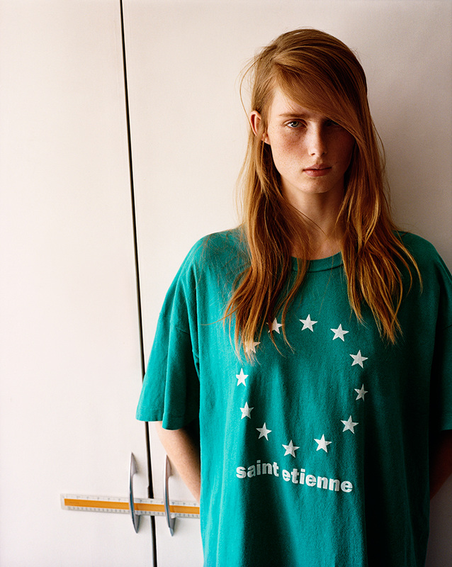
Since the late 1800's fashion has developed massively especially since the colossal changes in clothing after the mid 1900's. In the 21st century fashion reveals more coordination and style, and also tells you a lot about who a person is, as another form of identity. The sizes of models are now varied so both men and women feel more body confident. In contrast different colours are used to broadcast changes in seasons and new collections are published for these seasons as well. However, clothing is apart of fashion, as well as hair styles and make up; these factors all contribute to fashion, in which it is photographers job to capture.
|
|
Examples of fashion from magazines have proven to be an amazing source of inspiration to people of all ages especially women. A vast amount of photographers have gained fame by being photographers for major success magazines, such as Vogue and Bazzar. in which many take photos of products and models wearing new fashions including jewellery, shoes sand handbags, as well as clothes.
I have found large amounts of inspiration from many magazines and online, while on my search for photographers I found a photographer called Authur Elgort, who takes photos for Vogue in America, although he his over 70 years old he still continues to take photographs internationally. During his career, Arthur quickly became one of the best-known and most imitating photographers because he took different styles of photos with his models, the type of photos he took changed the fashion industry and created new ideas of what fashion photography was and what could become of it in the future. His style and influences created new looks for woman and their personal take on fashion. Because of this many of his photos have appeared regularly on the covers and in the contents of Vogue magazines across the world. His work with Vogue has gained him a well-known reputation, which also gave him the opportunity to shoot for Vogue’s international shoots, as well as many other high fashion magazines. His long career of over 40years has also given him the chance to work on many major adverts with high fashion industries and luxury brands.
|
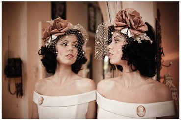
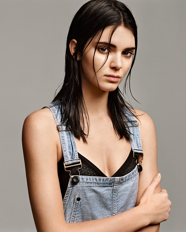
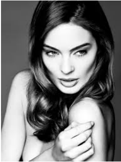
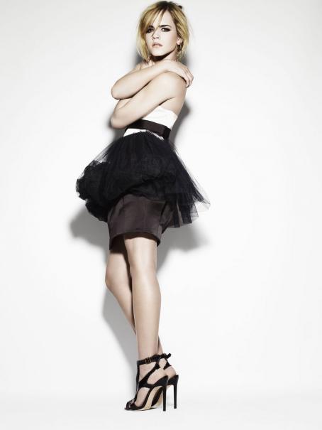
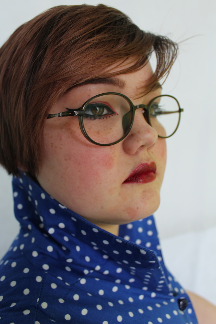
Arthur Elgorts, reputation in fashion has allowed him to visit countries all around the world, this particular image was taken for Vogue. In this photo I like how the model is positioned on the floor, with her torso slightly facing towards the left and with a angled bend in the legs. Throughout all of Arthurs work, there are a large variety of different poses, which show effect and purpose in each of his photos. furthermore the photos he takes are always very detailed, and have a balanced amount of contrast and brightness show that the clothing and accessories he photographs are advertised in there full capacity, in order to appeal more to the largely growing fashion culture.
|
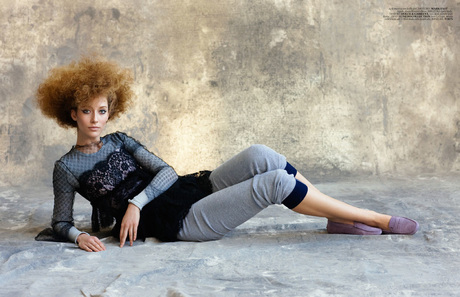
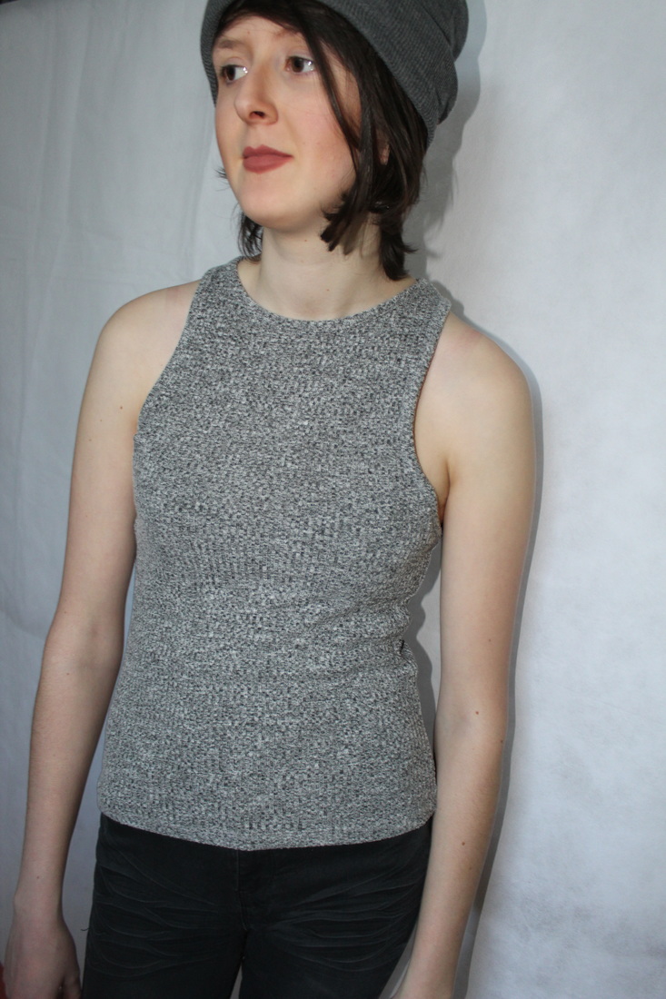
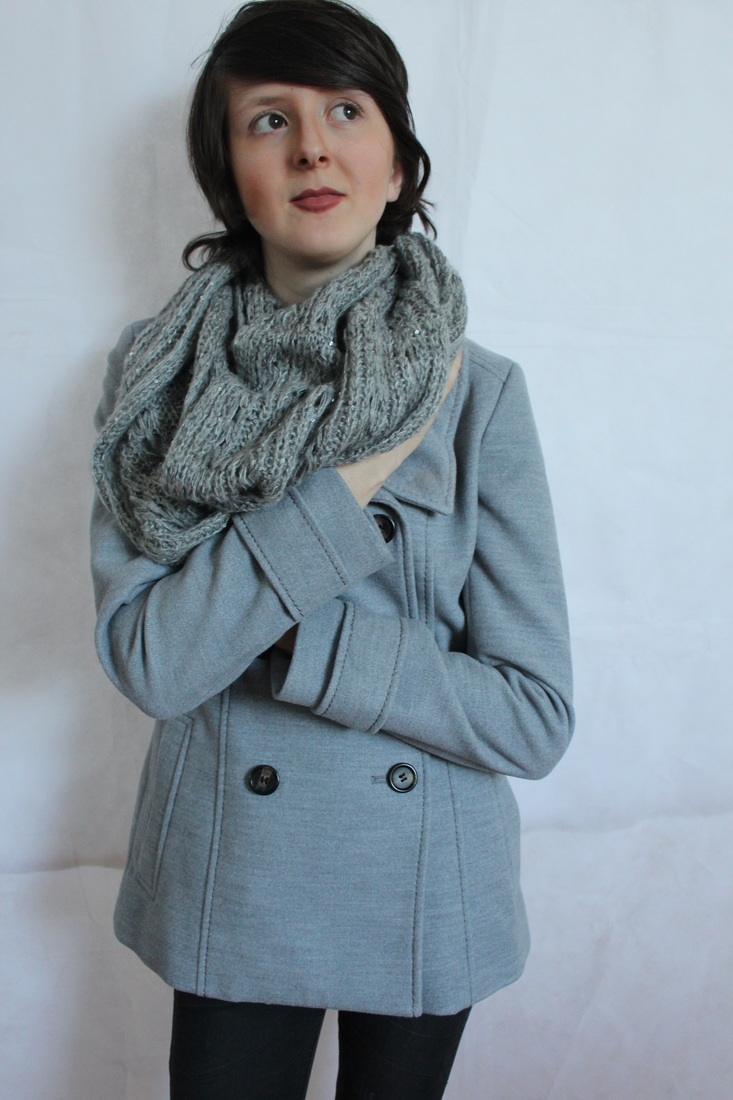
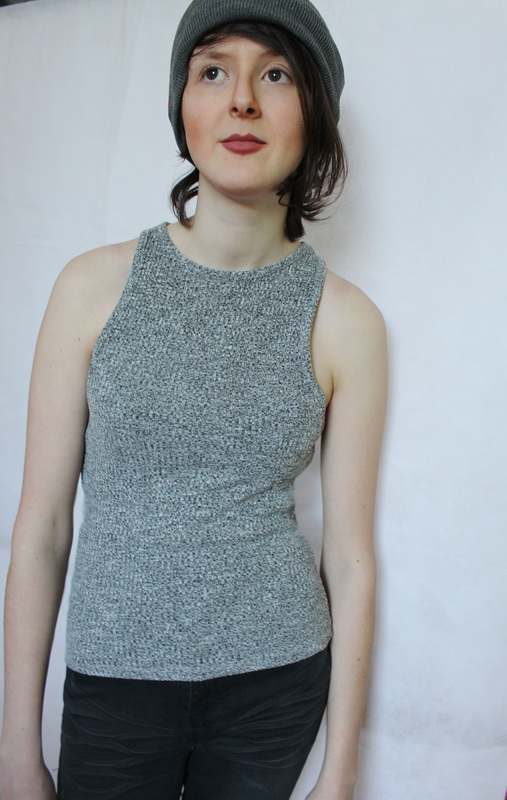
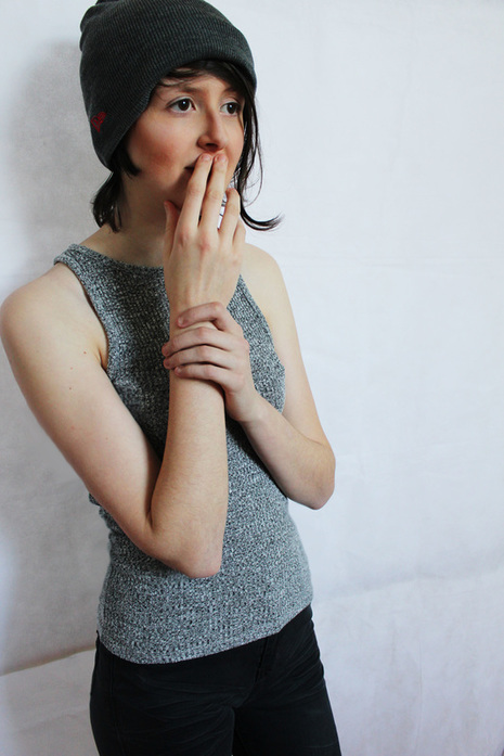
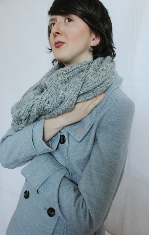
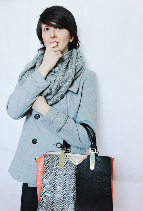
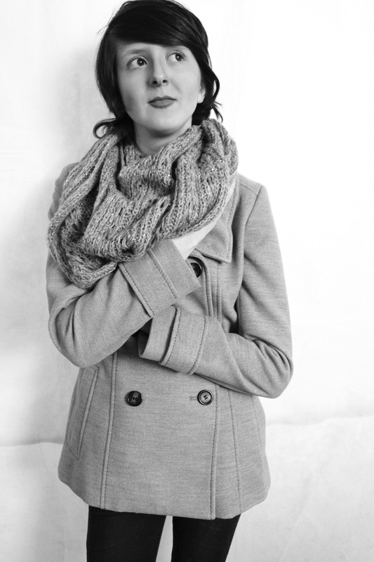
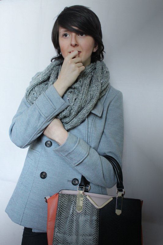
I particularly like how Arthurs work features a variation of seasonal changes. By doing this in his work he has been able to photograph different fashion statements by using new trending colours for each of the four seasons. For example, the photo to the left consists of different shades of grey and dark colours in the theme of winter. Furthermore, differences in clothing also shows the transition of the seasons in photography; for instance in winter fashion photography the majority of the featured clothing include thick material coats, scarfs and woollen hats. However unlike winter, summer and spring tend to have lighter weight materials with bright colours and repeated floral patterns.
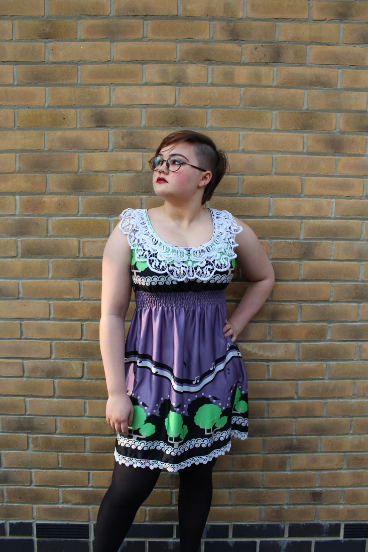
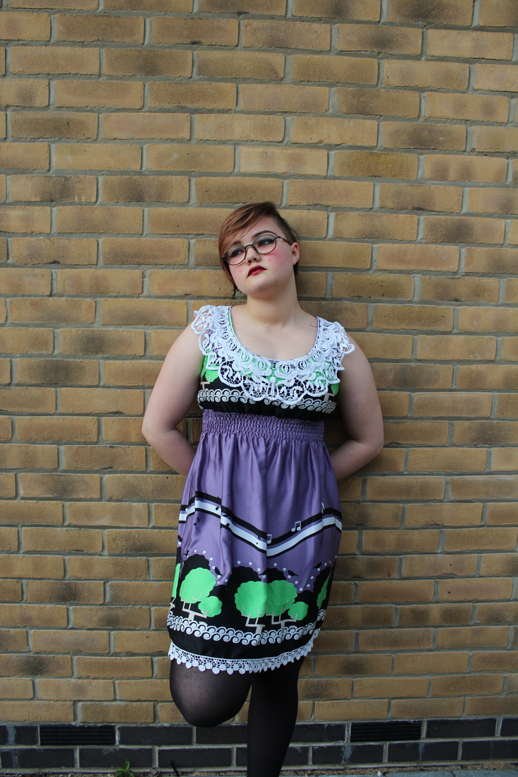
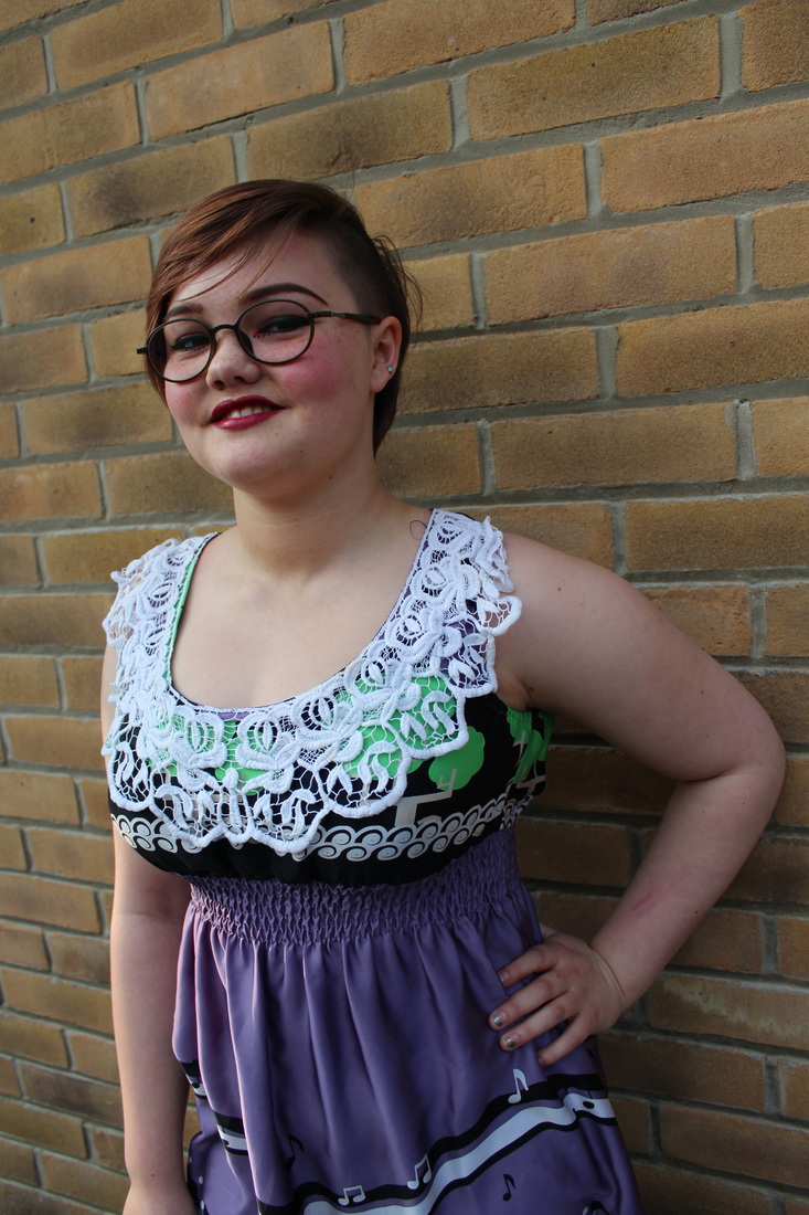
From this inspiration I will take photos of different colour schemes and clothes in response to some of the different seasons. I am very interested in photographing winter fashion as I can experiment with photographing models in different poses and with accessories that relate to the theme. Also with inspiration from Arthur I will take photos of models from different angles and with different lighting (artificial and natural) in the style of a photo-shoot. Also to experiment further with ideas, I would like to photograph handbags, shoes and jewellery, by going into detail with different products and the beauty of fashion. In addition to this, Ill also show model necklines, and other regions of the body; and also experiment with hair and makeup which generally feature in most major magazines |
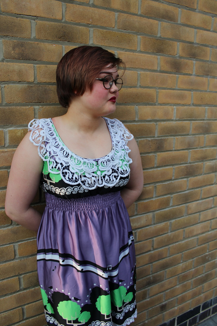
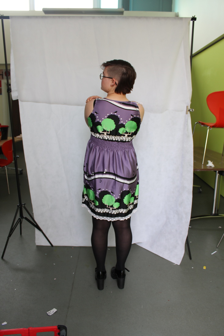
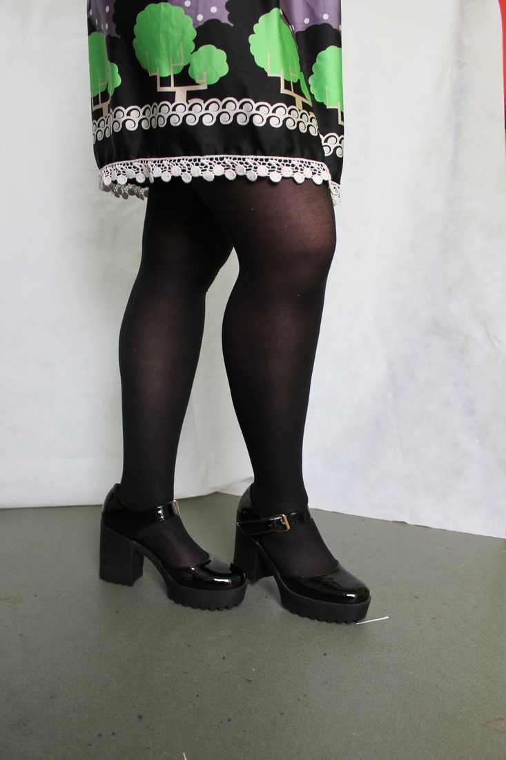
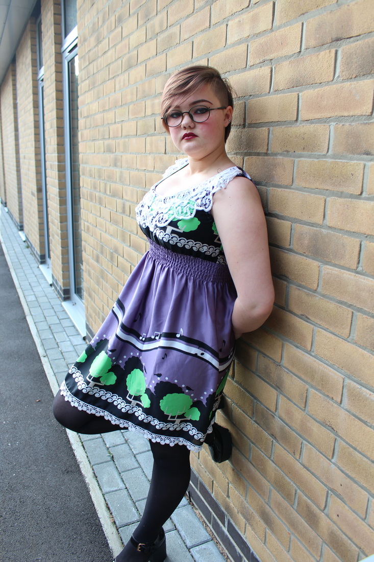
shoes shoes..SHOES my photographs
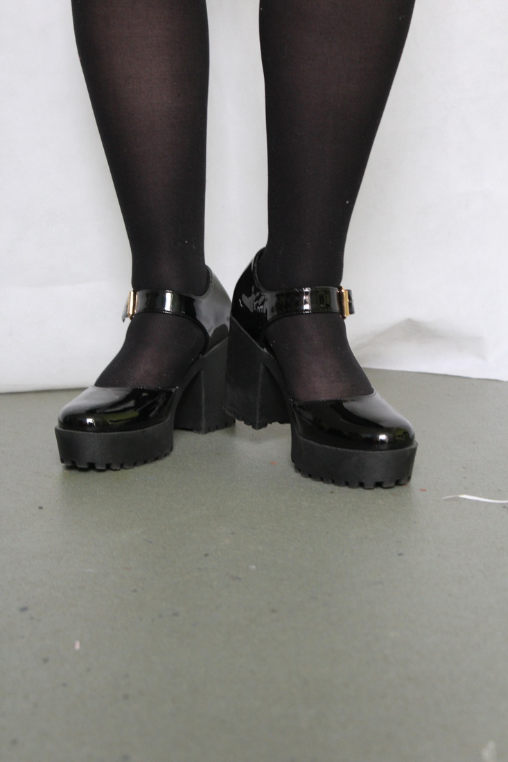
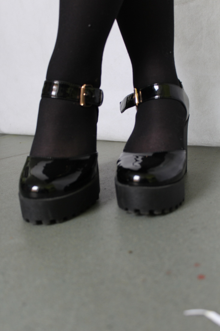
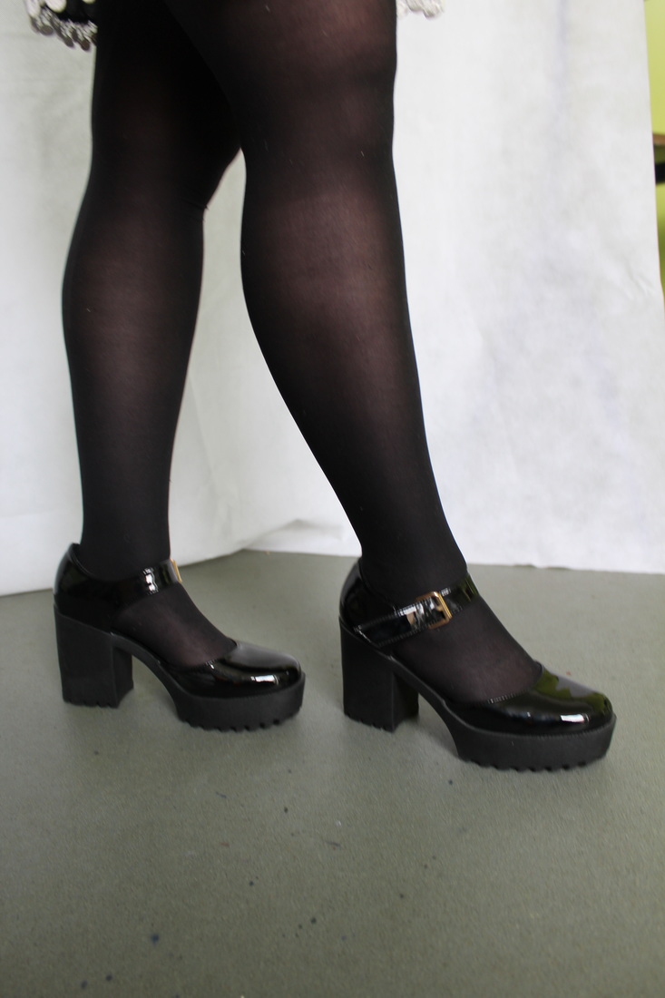
I took photographs of shoes in different poses in response to Arthurs work.
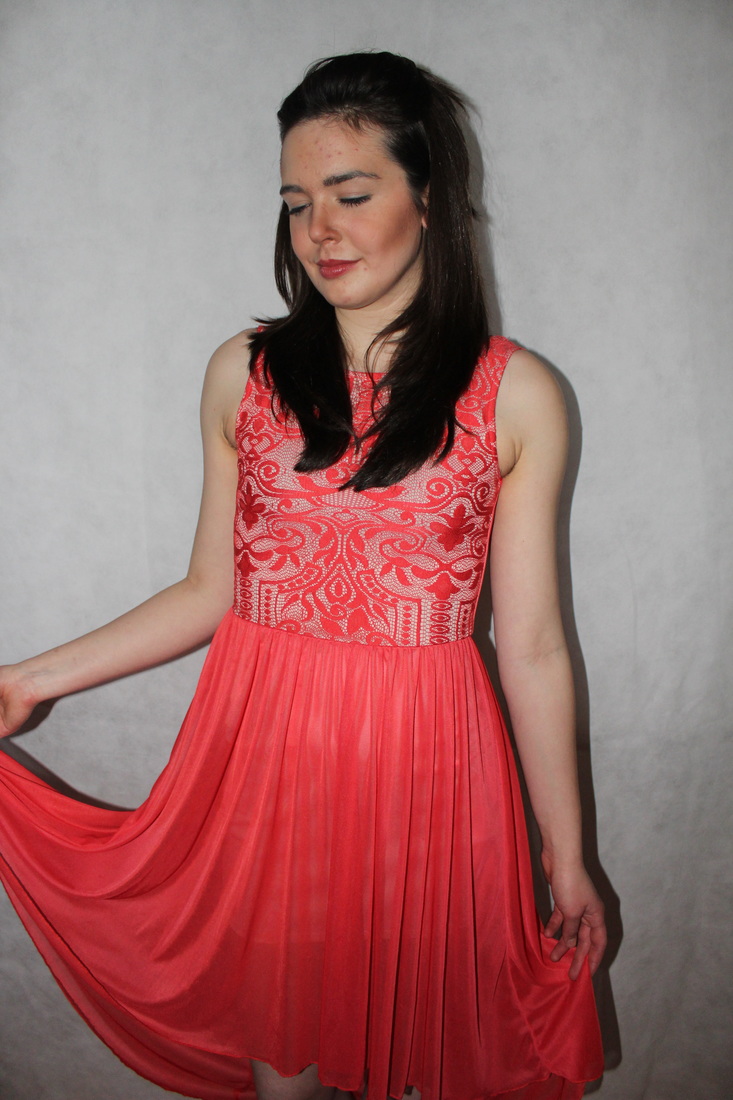
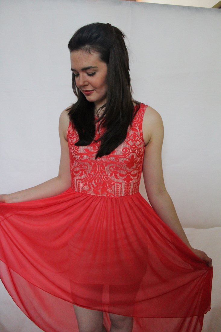
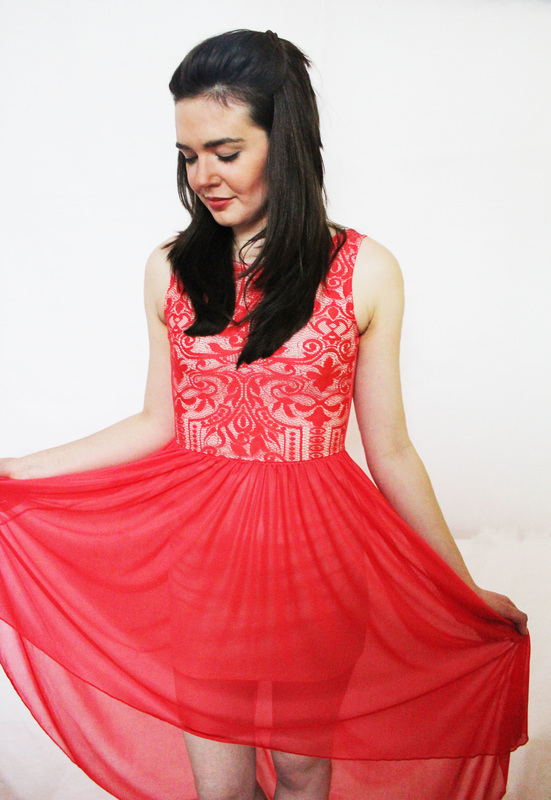
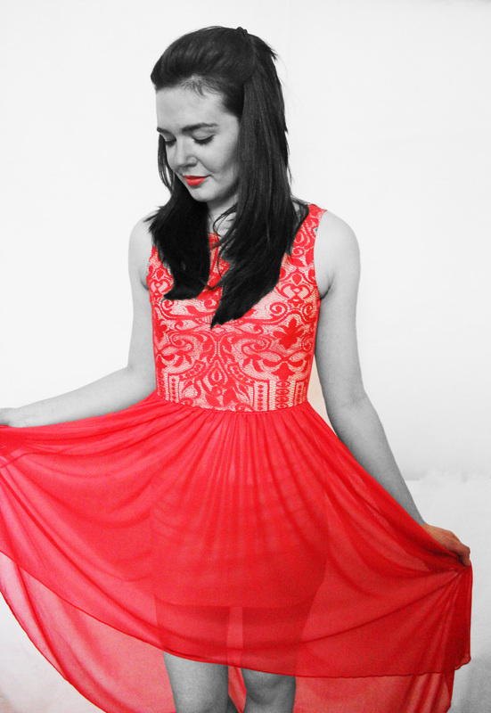
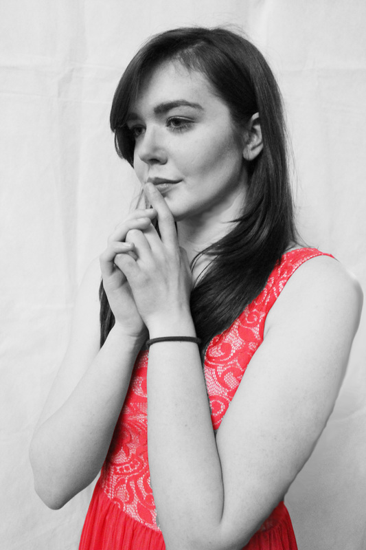
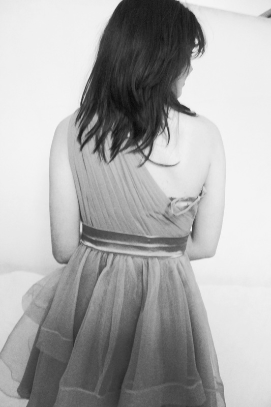
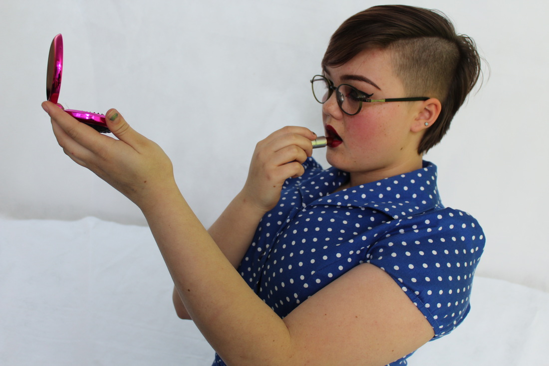
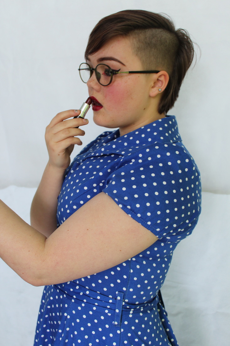
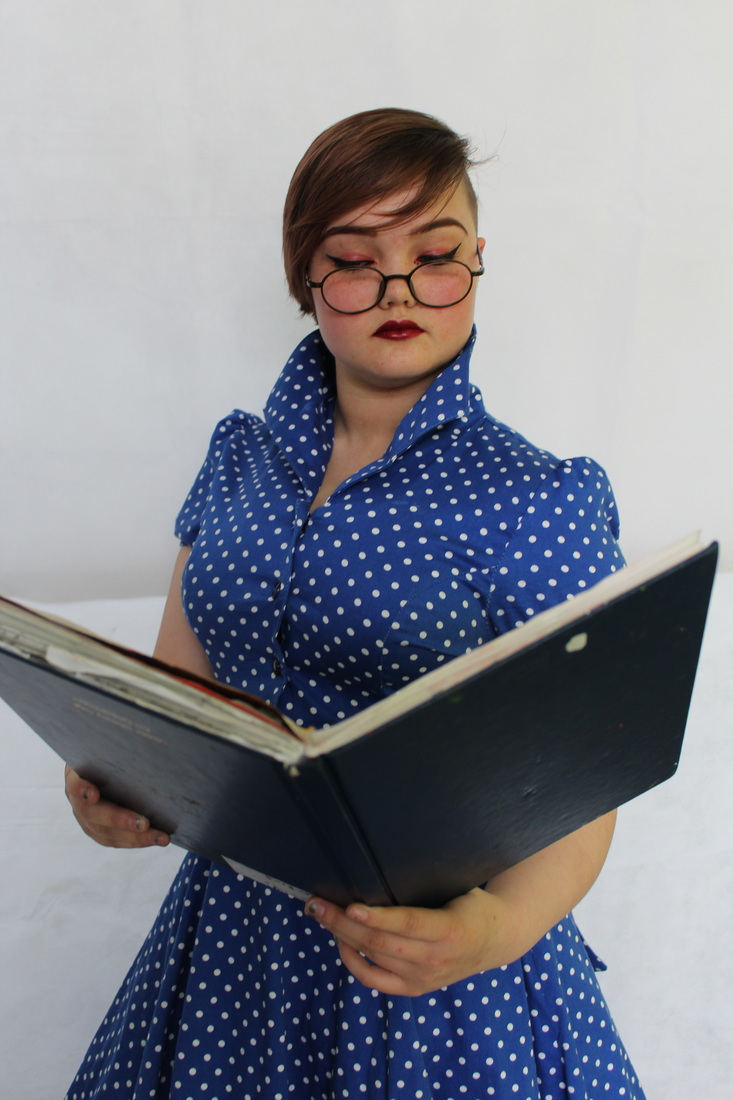
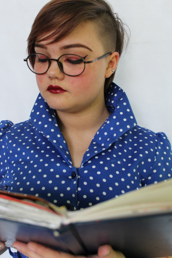
My response to Arthur Elgort

These are some of the original images I had taken before editing them in Photoshop. You can clearly see the difference between the brightness and enhanced quality of the images when compared to the digitally manipulated ones.
|
|
|
|

|
|
Refining my Responses
|
For these photos I decided to decrease the sizes of certain body parts when editing using the smudge tool; this allowed me to edit my photos more effectively and also provide the impression that the model had a smoother physique. I found that by doing this I could get rid of any imperfections and adjust the arms and upper jaw line for more added definition.
|
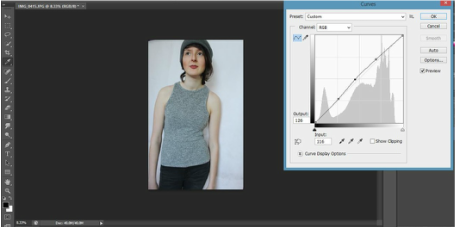
Here I used the 'curves tool' the curved tool allowed me to experiment with the possible outcomes of my images; using this allowed me to quickly and affectively edit my photos . By adjusting the graph points it created different effects including enhanced contrast, brightness, hues and shadows ad highlights without doing each of them at individually.
|
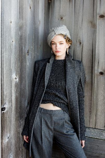
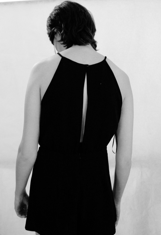
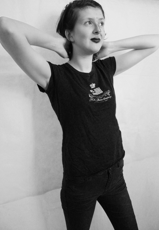
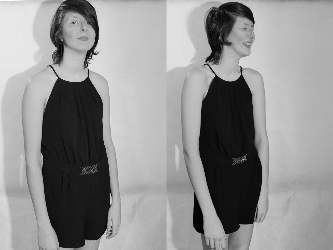
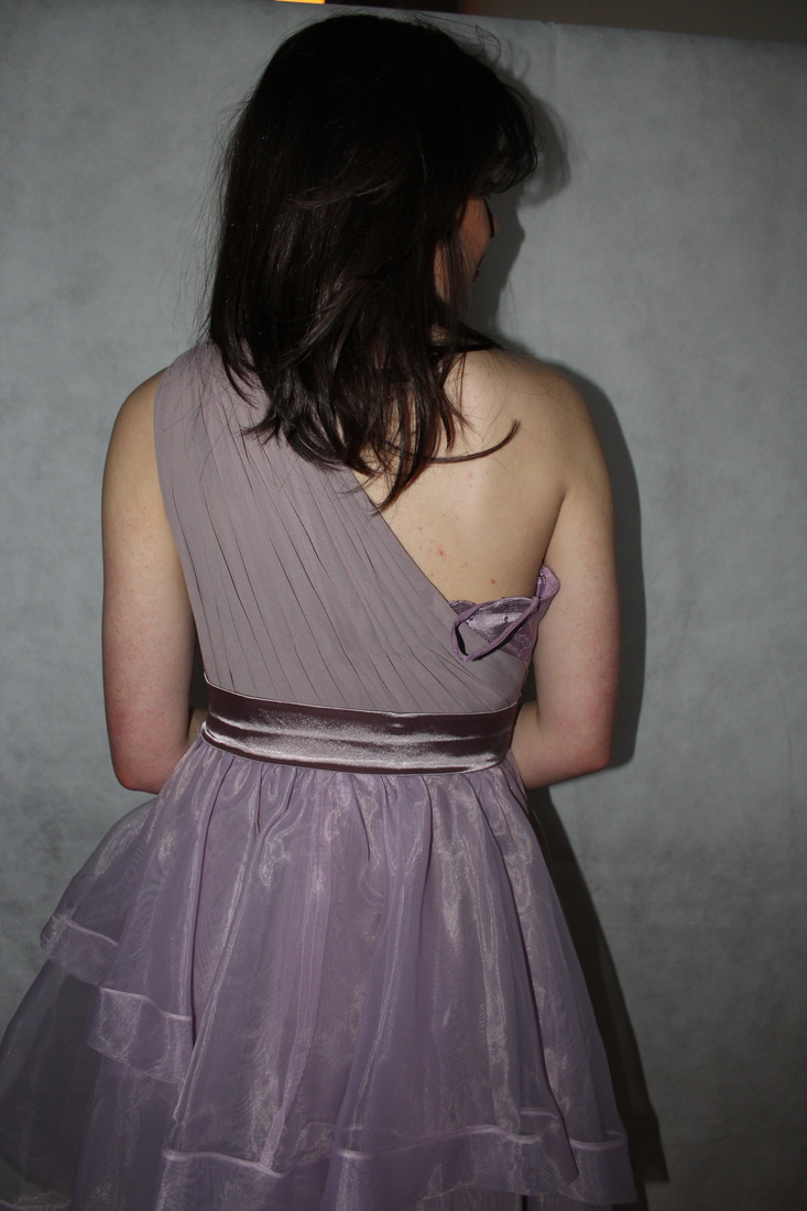
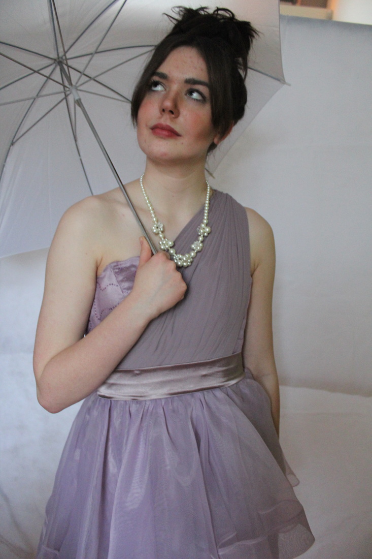
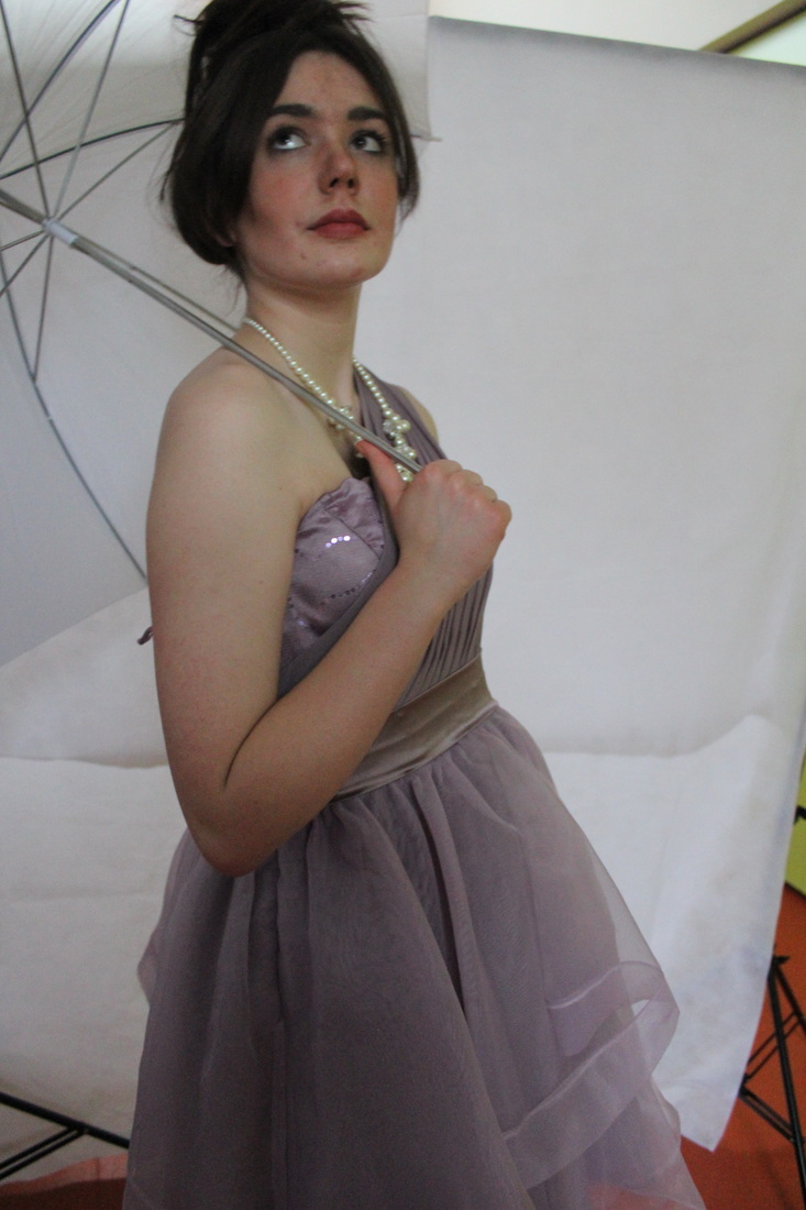
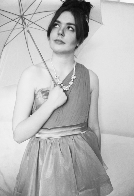
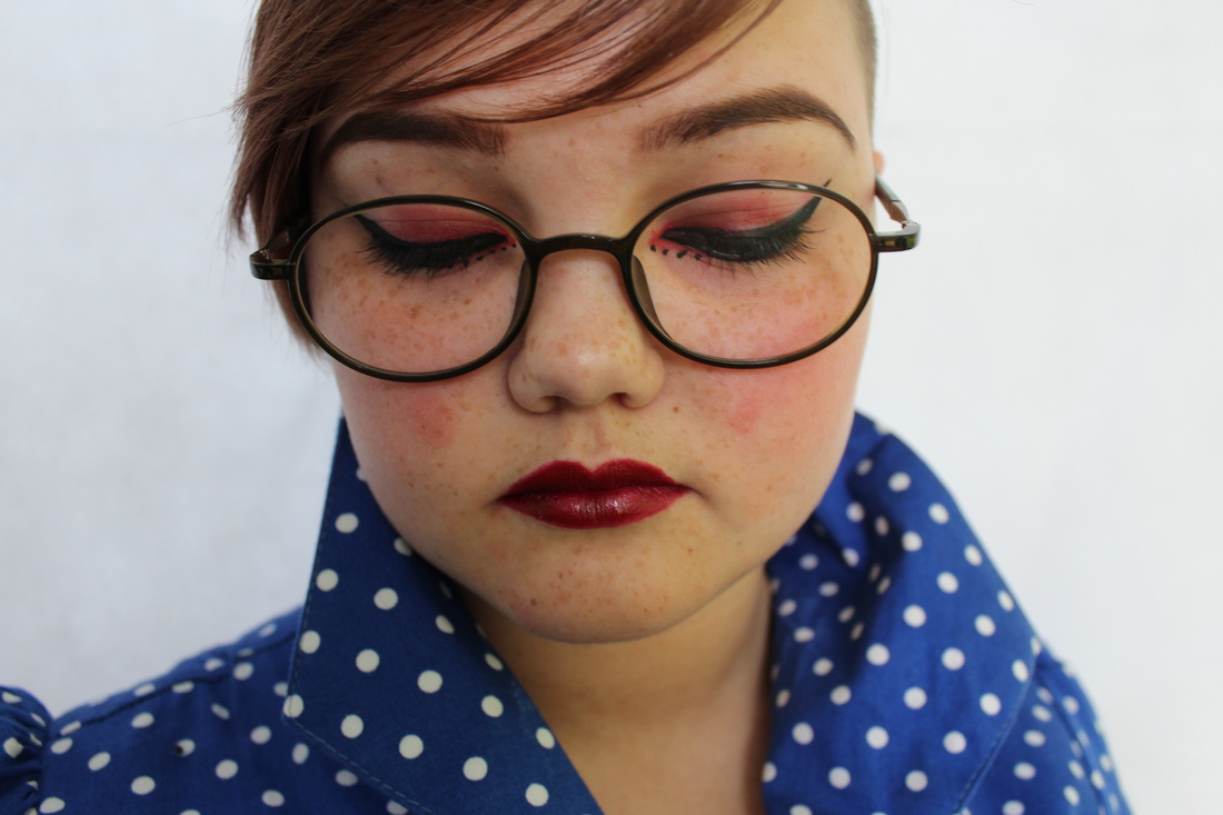
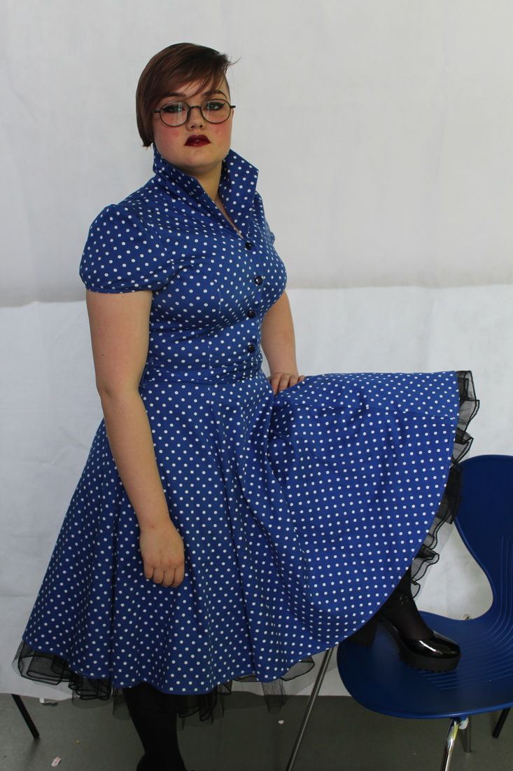
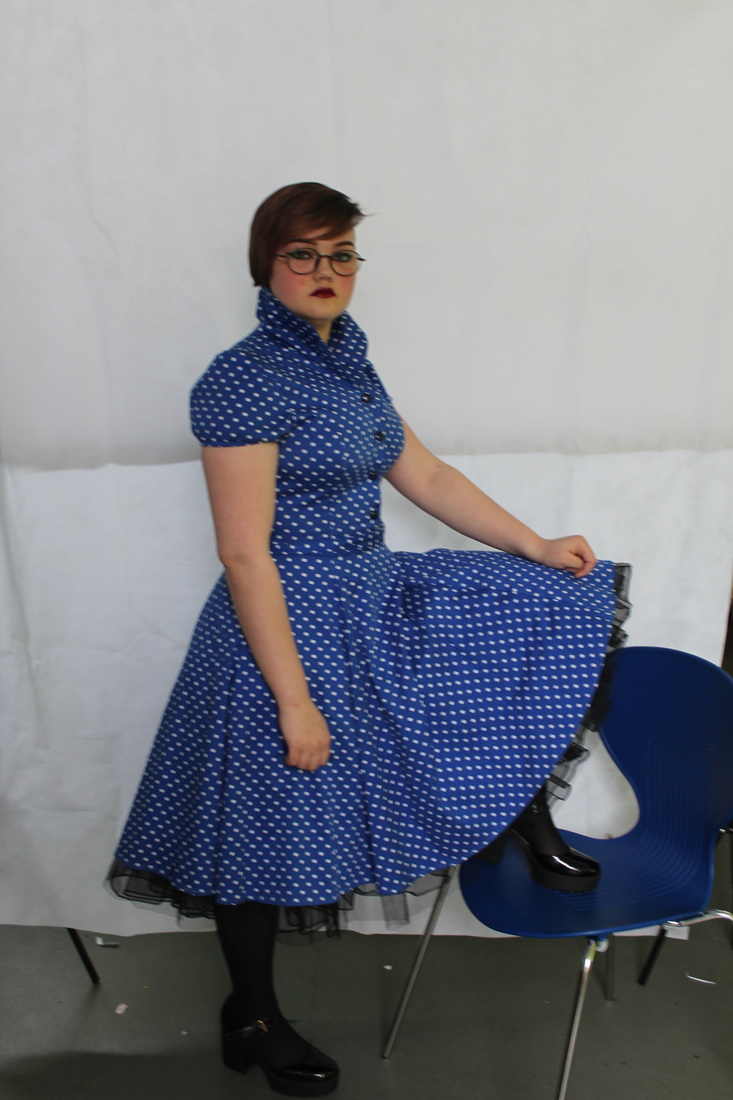
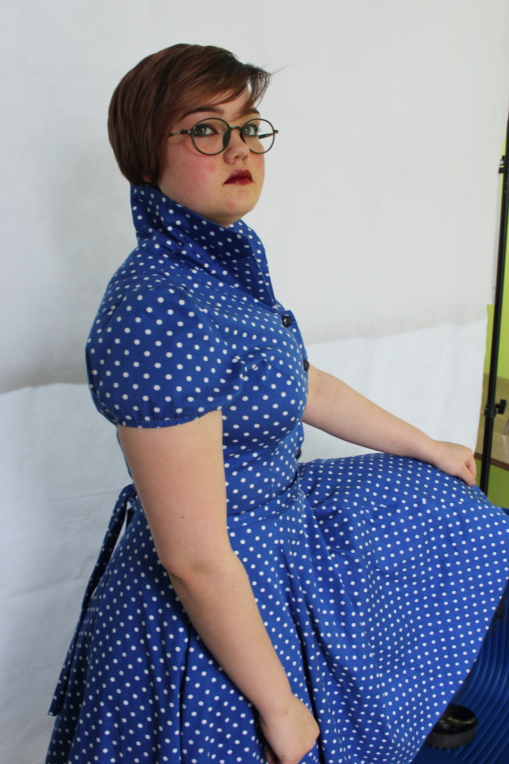
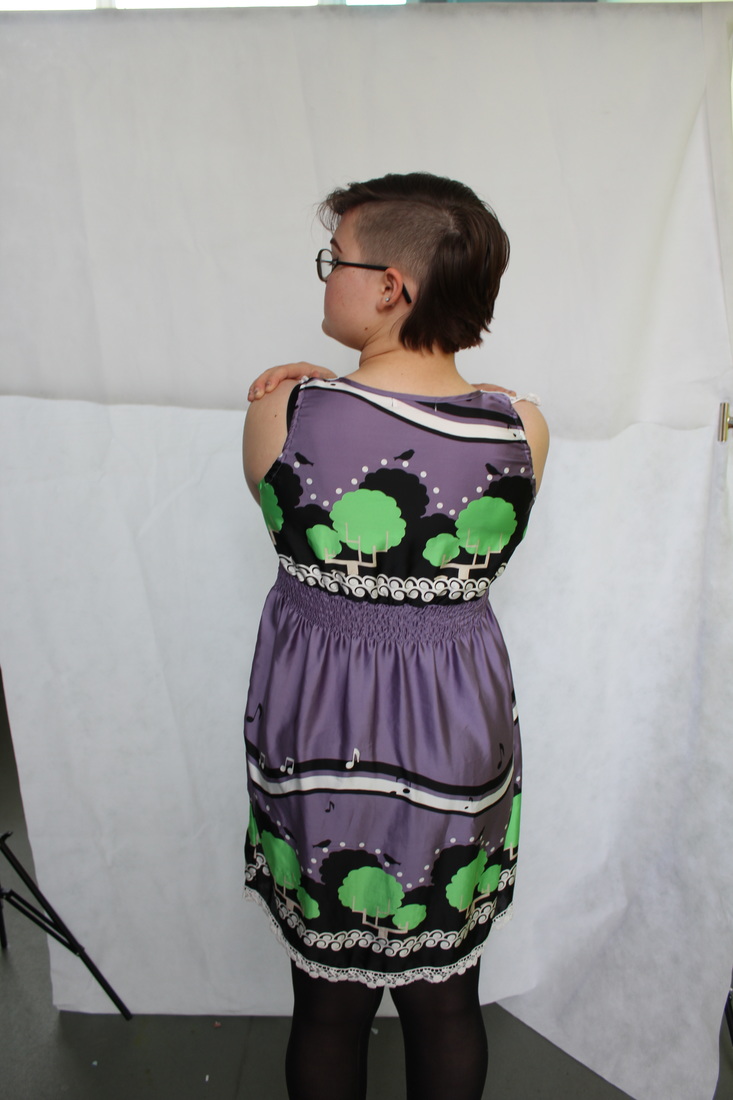
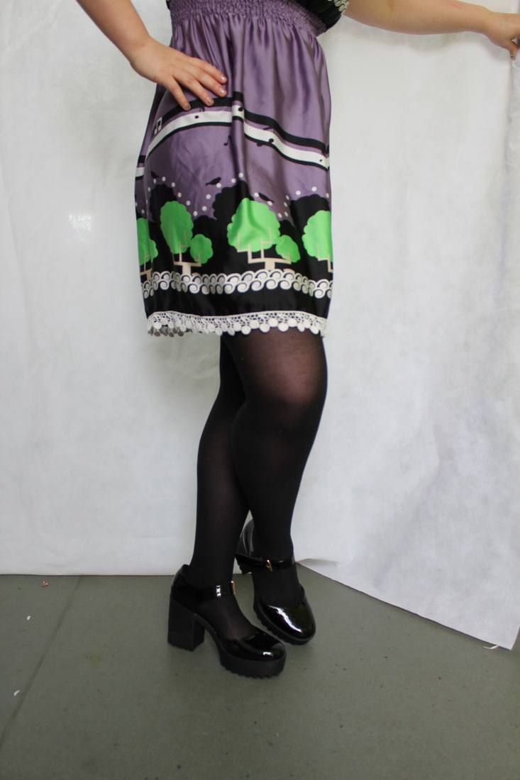
In response to the photographer Arthur Elgort, I have edited a selection of images and taken photos in inspiration of his fashion photography. In this particular photo shoot I focused on darker colours (in the theme colours) of this years winter collections in the fashion industry. I really like the uses of hats, scarfs and coats in different shades of grey that are featured in my work. When taking these photos I preferred the use of natural light, rather than artificial light as it looks more effective, and also the clothes didn't receive an amber glow which made the images dull away from a winter appearing scene; however the artificial light may become useful within another photo shoot.
When arranging and adjusting the position of my model I gained a lot of ideas from Arthurs work as well as other sources, including; magazines, posters and some other online sources. I thought carefully about how I wanted to broadcast the attitude of my model and how certain poses and eye direction (were the model is looking) could effect the overall appearance of the final outcome.
For editing these photos I enhanced there brightness and adjusted contrast levels before I used any other tools on Photoshop. After this, I began to use the spot healing tool on various areas to remove access moles, majority of redness in specific areas and other imperfections so that the model looked at their best. Another tool i'd used was black and white, in certain images I found that they were best suited in colour, however two of the edits above were transferred into black and white as I found the images were more appealing and effective.
Rankin
|
For my other photographer choice I have chosen to select Rankin. I have experienced the type of photography Rankin has produced in one of my previous projects (identity). When previously gazing at Rankins work before, I had noticed his work in the fashion industry which particularly caught my eye beforehand. In result to this, Rankin has proven to be an influential photographer in many regions including clothing and fashion photography.
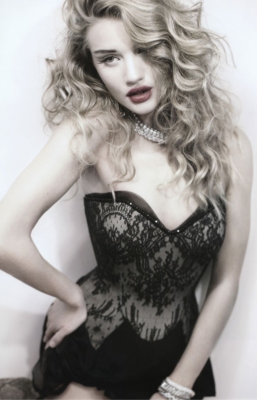
Rankin has a reputation for his photographs of famous people, and has gained a more renowned reputation for his work. In response to his career, Rankin has shot covers for Elle, German Vogue, Harpers Bazaar and many more magazines world wide. As well as photos for cosmetic and beauty companies including Pantene. |
|
|
Throughout his career Rankin has successfully developed a strong status in forming and effectively creating new trends, and has also been a major influence in bringing in some of the best opportunities in fashion to the 'foreground'. By experimenting with different materials and clothing Rankin has produced a range of successful images. I particularly like how Rankin edits images into black and white; this is because it adds a classic twist to images and also makes photograph look more vintage.
However Rankin doesn't always turn his photos into a high contrasted black and white, instead he tends to use basic natural coloured clothing or overly bright coloured clothes on basic backgrounds to show clothing textures and designs in his work. Unlike other photographers Rankin prefers to work in the studio rather than outside ,only when necessary will Rankins photos be taken outside the studio. |
My Response to Rankin
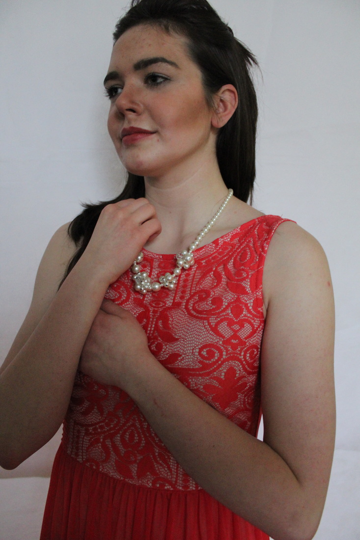
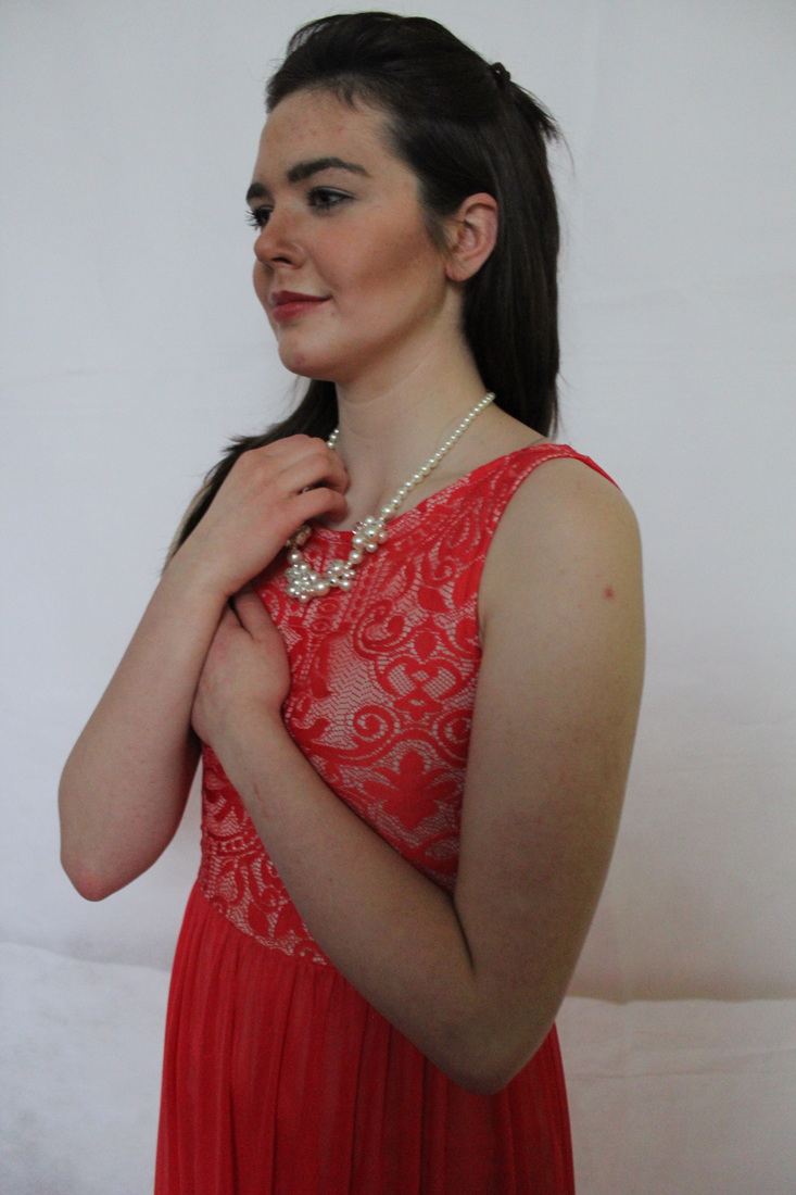
In the unedited photos you can see how Photoshop has drastically enhanced the brightness of the photos compared to the originals. Also with Photoshop I was able to fix the blemishes on my models face and edit any unwanted colour pigments on the facial and upper body areas by using the following; spot healing brush, blur tool and the smudge tool, which I believe had successfully improved the quality of my images and the appearance of my model, very effectively. In this photo-shoot I decided to photograph the model in dresses and accessories such as pearls to add elegance and glamour to the images.
Destroy Project - Rankin
,Rankin had created portraits and collaborated these portraits with artwork to make his collection ‘destroy’ in which he had turned an original image into a piece of art, this project was originally released in November 2009. In this work Rankin had added applique, paint and tape to prints of his photographs, in which he also cut up images and rearranged the aspects of certain images.
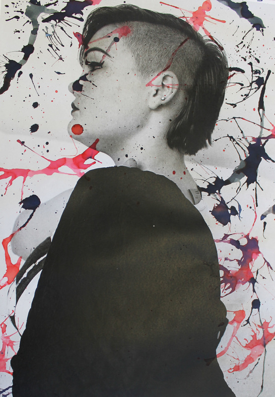
I like the idea of Rankins destroy project as a possible exam idea. I really like how Rankin has turned the photo on the left in black and white and drizzled it with paint and I would definitely like to recreate Rankins project with more creativity for the exam. I would personally like to paint over printed out photographs and cut and stitch into images. It is also a possible idea that I could use makeup to create a mixed media and intense finish image instead of paints as it could relate more to clothing and fashion. I could do this by using lipstick to cover the images and write across the prints, as well as using nail varnish to create drizzles and drops. Also to develop ideas further I could preserve flowers and stick them onto the image like the image above on the right.
I like the idea of Rankins destroy project as a possible exam idea. I really like how Rankin has turned the photo on the left in black and white and drizzled it with paint and I would definitely like to recreate Rankins project with more creativity for the exam. I would personally like to paint over printed out photographs and cut and stitch into images. It is also a possible idea that I could use makeup to create a mixed media and intense finish image instead of paints as it could relate more to clothing and fashion. I could do this by using lipstick to cover the images and write across the prints, as well as using nail varnish to create drizzles and drops. Also to develop ideas further I could preserve flowers and stick them onto the image like the image above on the right.
|
Ideas surrounding Rankin Project:
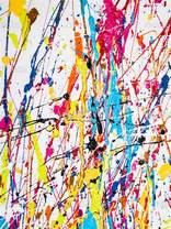
To the left is one way in which I could decorate the images I print. Here the artist has randomly distributed paint in different directions to create this effect. Rankin had used this effect on his kylie black and white edit (only using different shades of pink) but not on a major scale like this artist has. if I were to recreate this effect I would use nail varnish which would tie in with makeup/fashion and clothing to develop my ideas further in a more practical manor. |
|
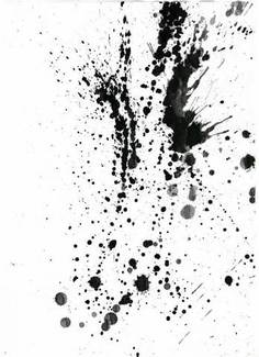
The image to the right I another way in which I could
decorate my images in the style of Rankin. This design was made by vigorously applying ink which creates a more messy and broad splatter than the paint because its thinner and more flexible. I can achieve this look by applying large dots of ink to the images, and then by using a straw, lightly blow into the desired direction, however I must do this quickly so that the ink doesn't settle or start to sink into the paper too much. To create the smaller splats, I found that a paint brush is the most effective way as you gently tap the paint brush onto your forefinger over the image to create a more suttle splatter or tap more vigorously to achieve a more broad splatter radius with occasional larger splats. |
|
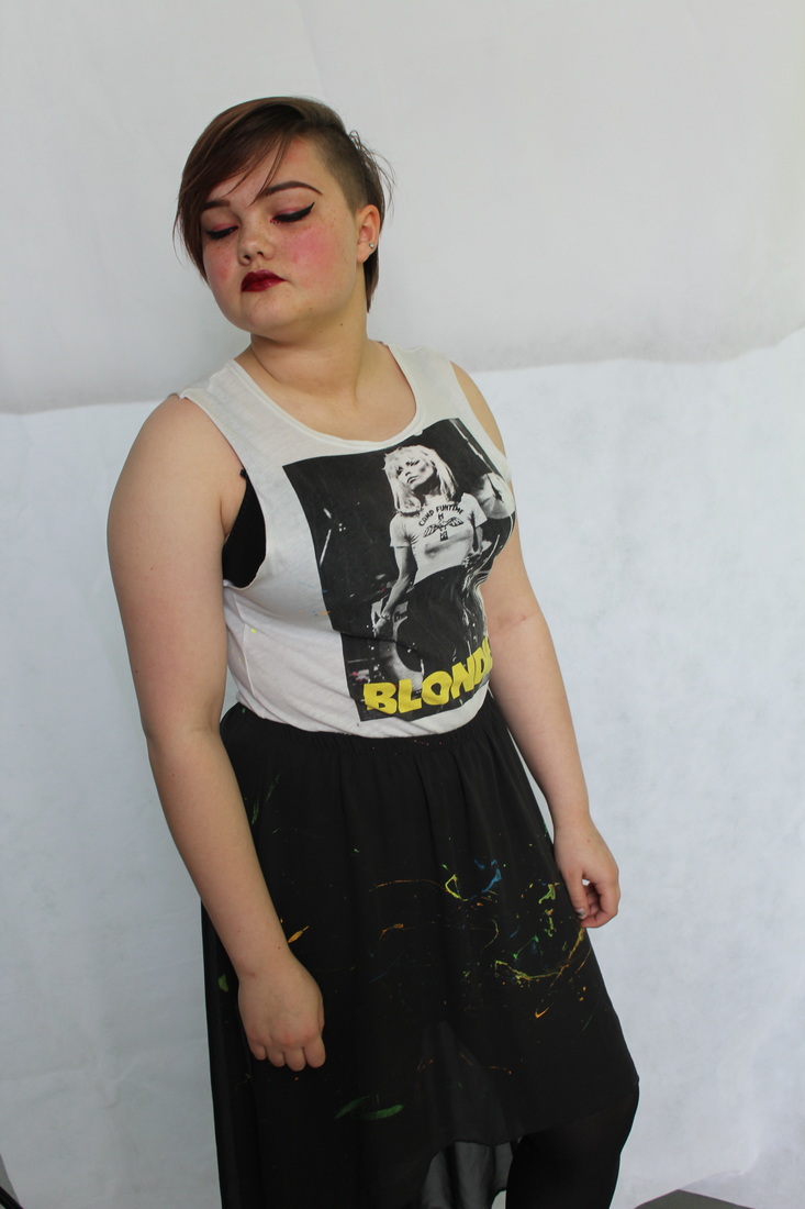
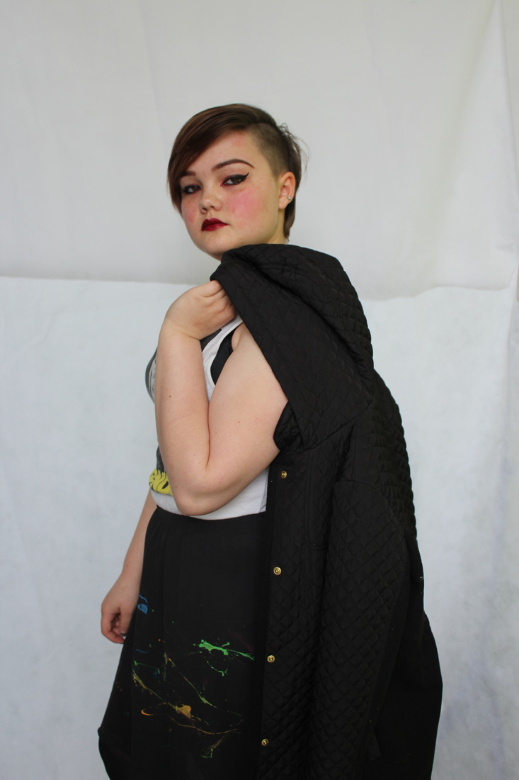
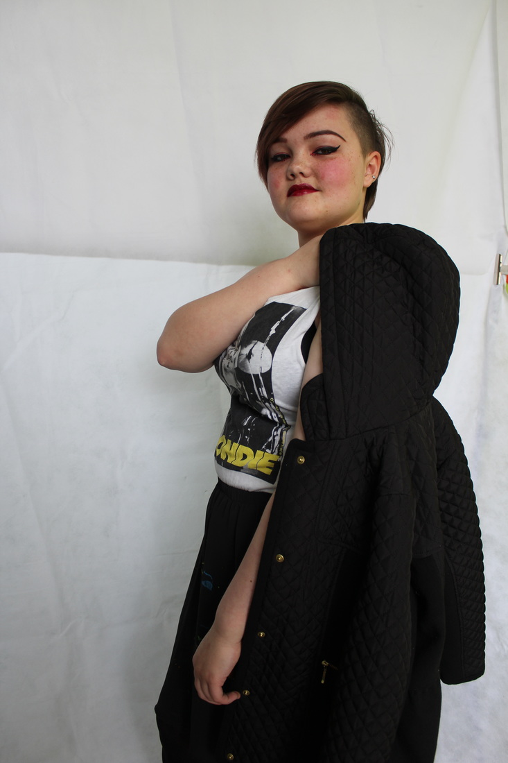
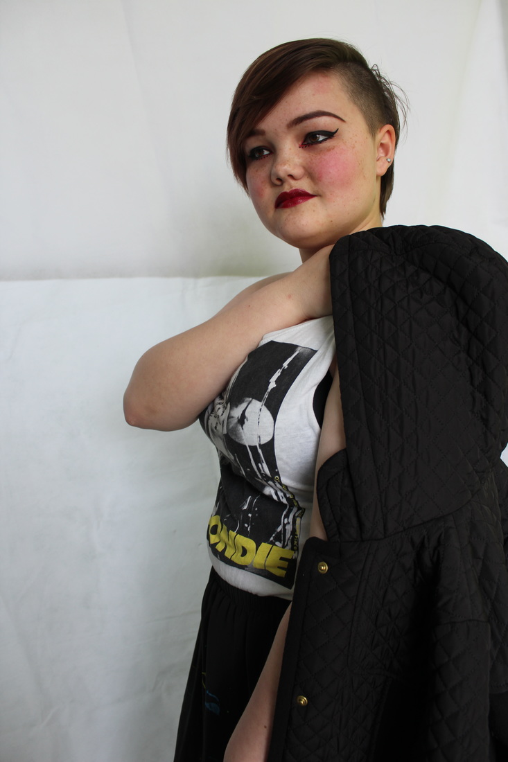
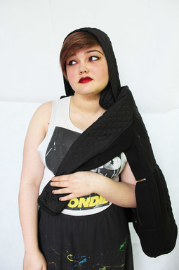
BLONDE..
version - unedited
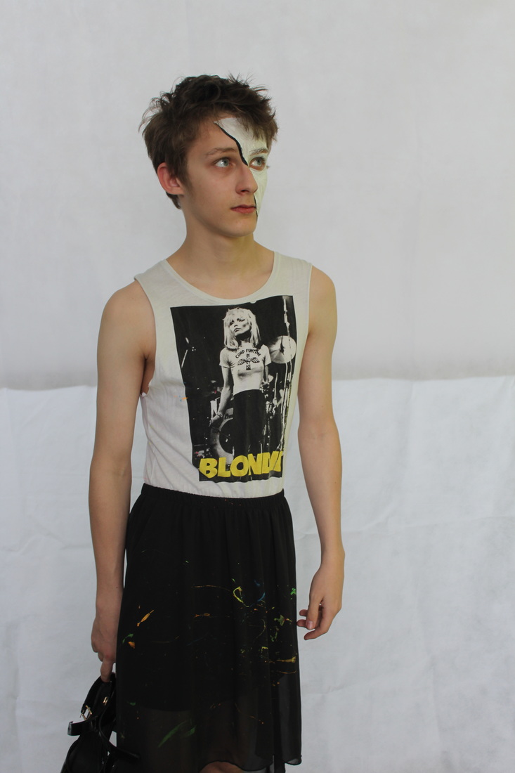
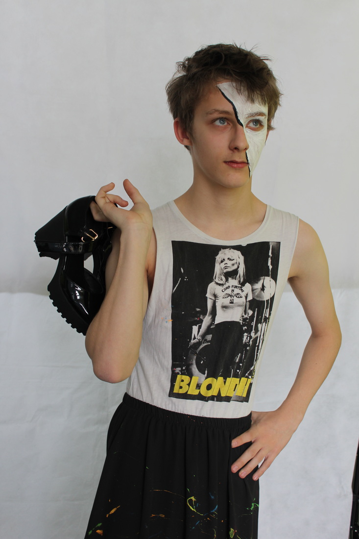
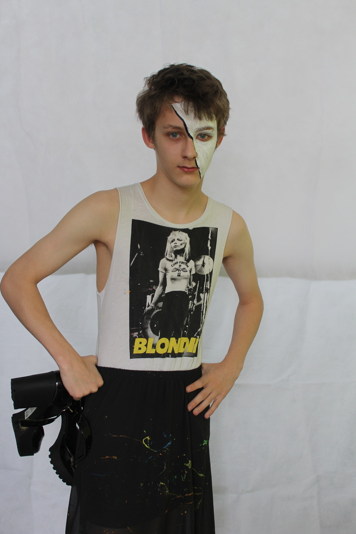
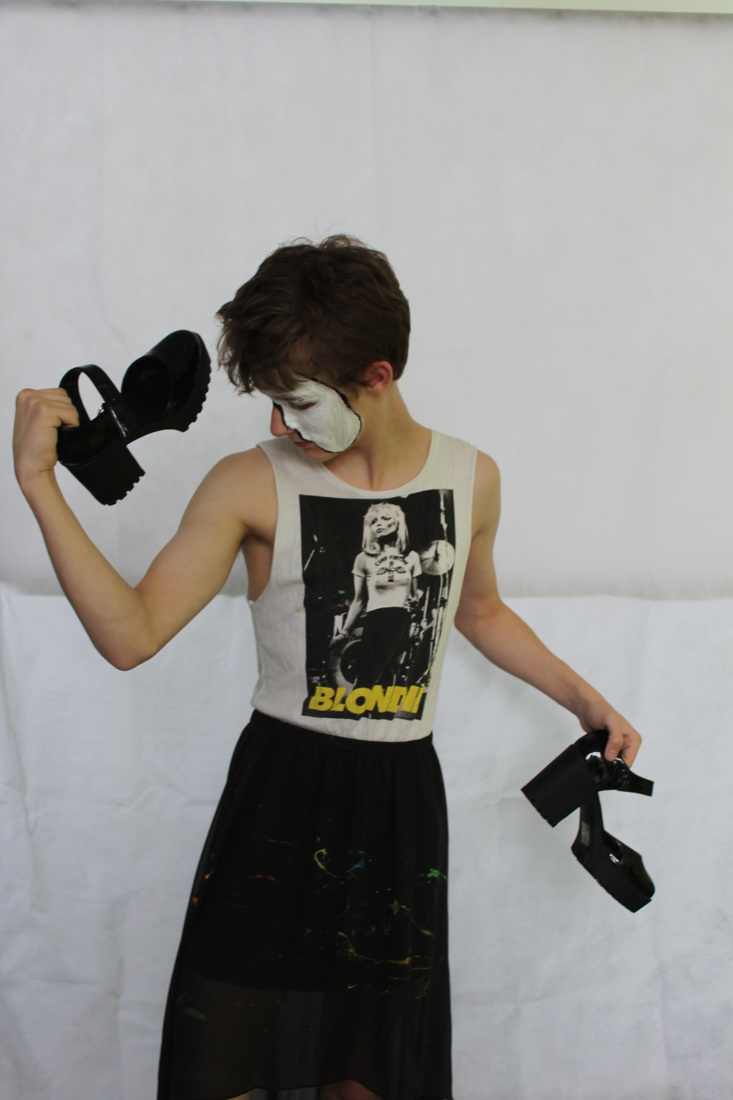
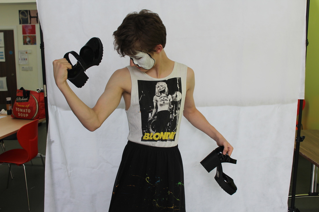
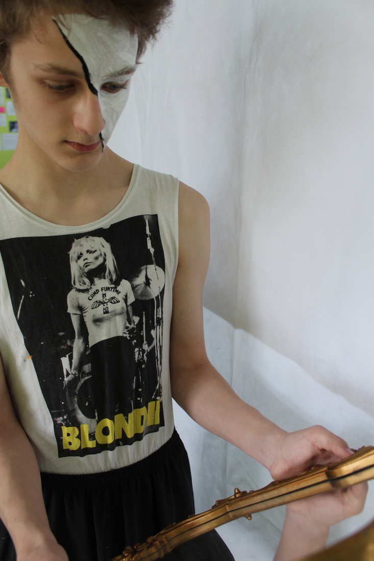

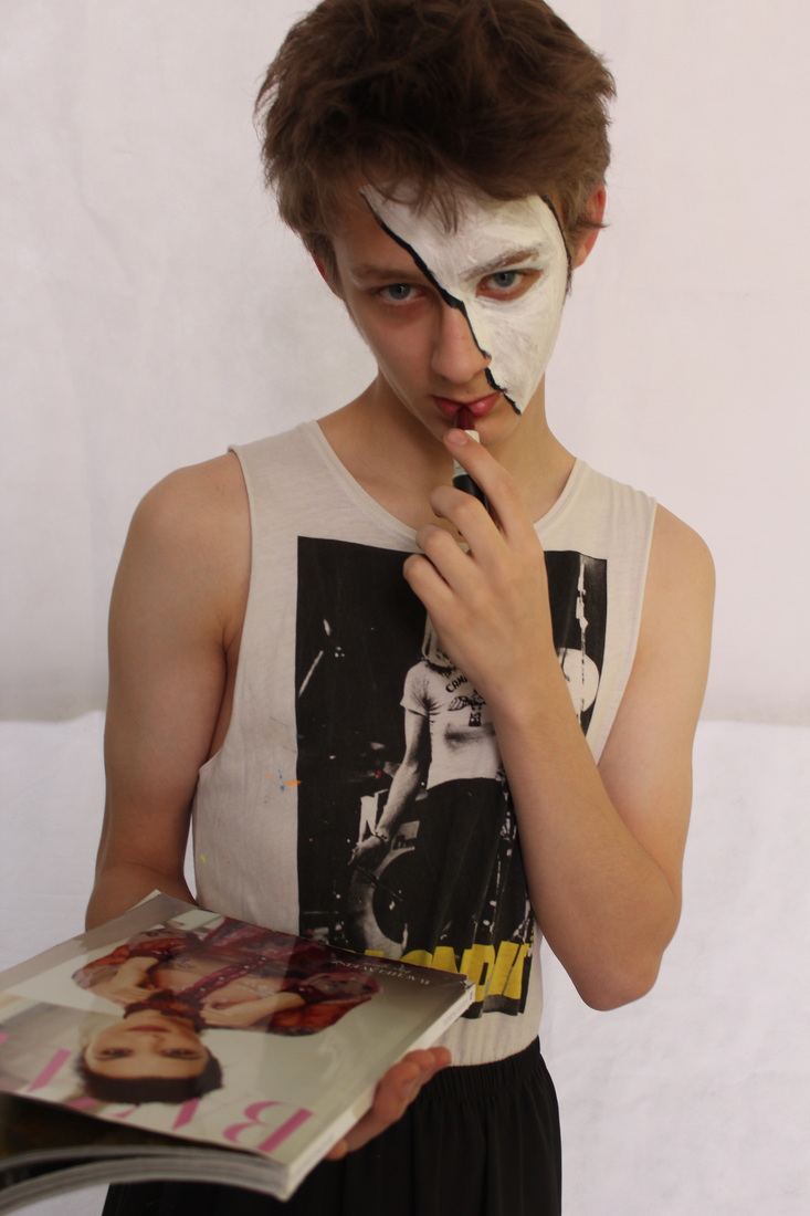
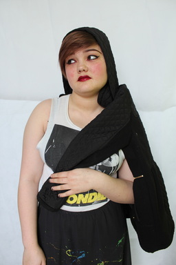
Here I have gone with the powerful message of not judging people on what they wear. I did this so that I could add more emotion to the project and by taking it further with sexuality and how clothing/fashion can define who a person is. Todays society is very judgemental and many people base their opinions on a persons appearance, which is morally wrong. Just because someone may appear physically appealing doesn't mean they are any better than anyone else, especially as some people may struggle to afford high priced clothing and top quality designers . I put my model in a typical women's dress (which had been splatted with UV paint) and asked him to pose with high heels and fashion magazines to show that people should have the freedom to dress and appear how they wish without being judged.
it is mainly men that get judged In society for wearing apparent "women's colours" or "makeup" makeup is another way of making a person feel good about themselves by temporarily altering your appearance. Yes on average women wear makeup more then men but does that mean that mean can't wear it too there's nothing wrong with wanting to look good. Also is it gay for a man to wear colours such as pink and purple, considering we don't judge women for wearing different colours why should men?
it is mainly men that get judged In society for wearing apparent "women's colours" or "makeup" makeup is another way of making a person feel good about themselves by temporarily altering your appearance. Yes on average women wear makeup more then men but does that mean that mean can't wear it too there's nothing wrong with wanting to look good. Also is it gay for a man to wear colours such as pink and purple, considering we don't judge women for wearing different colours why should men?
Blonde with attitude
unedited version
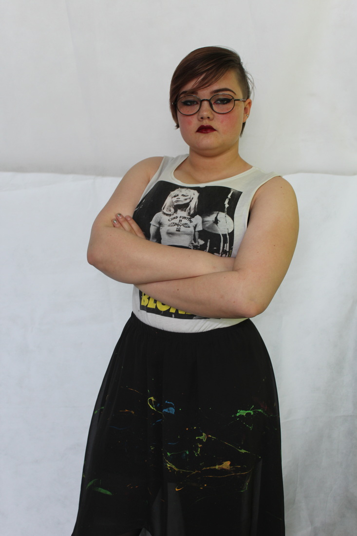
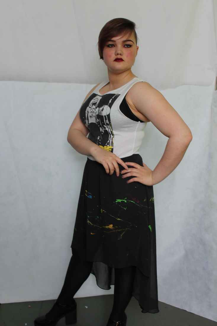
By using this dress again on a female model I was able to show the transition between how men and women can both wear the same clothing in different ways and have two completely images and two interpretations from the person looking at them.
I really like how different the two photo-shoots were and how the fashion people wear give a different view on the person themselves. I believe both sets of photos where successful at showing this transition and plan to use these images in the exam, but of course editing them beforehand..
I really like how different the two photo-shoots were and how the fashion people wear give a different view on the person themselves. I believe both sets of photos where successful at showing this transition and plan to use these images in the exam, but of course editing them beforehand..
I thought it was the 70'S
unedited
In these images I wanted to let my model express her own clothing, I felt that this was important as she would feel more comfortable during the photo-shoot and of course she would also freely be able to express herself. I really enjoyed this photo-shoot as it gave me an insight to how she dresses and how she openly loves the fashion (and music) from the late 1900's which was really inspiring and a great opportunity to capture.
Im wearing this for me..
For this series of images, I took pictures of my model in clothing she doesn't usually wear and for this reason it put her more out of her comfort zone.
My version of destroy
Before the exam I knew it was important to try out my own interpretation of Rankins Destroy project to insure I knew what I was doing in the exam and to make sure it was the right direction to go in for this project. I plan to use more materials in the real exam compared to these mini mock up designs.
I plan present the real exam in a sketch book in which I would explain my ideas, give the photos interesting titles that go with the theme of the photograph, and also explain how I have taken the original photograph, how I have manipulated it and what I believe the effects of the image have been. The materials I wish to use for the exam designs will involve makeup products (as I had previously mentioned before hand) to involve the designs even more with fashion and clothing. As well as using materials such as beads and paint. Also in the exam I will present the stages I took while preparing the exam as I will be doing this exam practically and not electronically.
I plan present the real exam in a sketch book in which I would explain my ideas, give the photos interesting titles that go with the theme of the photograph, and also explain how I have taken the original photograph, how I have manipulated it and what I believe the effects of the image have been. The materials I wish to use for the exam designs will involve makeup products (as I had previously mentioned before hand) to involve the designs even more with fashion and clothing. As well as using materials such as beads and paint. Also in the exam I will present the stages I took while preparing the exam as I will be doing this exam practically and not electronically.
In this particular mock version of Rankin's destroy project, I had interpreted his style by using ink in shades black, brilliant red and scarlet. By using a straw I as able to direct and merge the different inks together and create a less precise look to the image which I really liked as its more original and creative.
Refining my responses to Rankin
BLONDE
In this image I used a range of tools to digitally manipulate this image and improve it in many ways. Tools of which include, hue and saturation, brightness and contrast, quick selection tool, spot healing brush and mostly the smudge tool. I mainly used this too to enhance certain features of my model and decrease the size of certain features including the arms and nose. I used the spot healing and smudge tool to reduce the redness of my models cheeks. Also I used the smudge tool to increase the size of my models lips and define her face more so it appeared less rounded and more physically shaped.
|
This is the original image before it had been edited, as you can see the background is dark and hazy and obviously not as clear and vibrant as the image to the left. when looking at the models features, in this image the cheeks appear more rouged and flustered and the bridge of the nose appears less defined making the nose appear larger. Also in the image above the facial shape is larger and more rounded so by using the smudge tool this allowed me to pull up the lower region and side regions of the face to make the image on the left reveal the models face as more defined and more appealing.
Step 1:
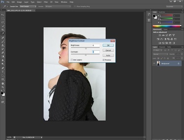
To begin the editing process I started by enhancing and adjusting the brightness and contrast in Photoshop, this was because the original of this image was fairly dark. However, after brightening the image it enabled me to see it clearer and have it appear more focused than before. From this point in my editing, I was able to pin point what I needed to do to manipulate this particular image further, and decide what other alterations I could do to amend this image effectively and in the correct way. |
|
Step 2:
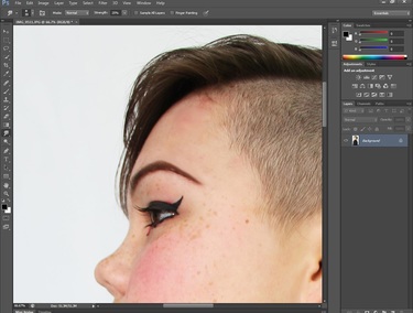
After step 1, I had decided to make alterations to the shape of certain areas of the image including the eyebrows, jaw shape, hairline, the ear and makeup. The tool that enabled me to do this was the "smudge tool". To neaten up the hair line I adjusted the strength of the tool to 20% and pushed back the hair back from the edges so that it was neater and to a less uneven standard, I also used this method to adjust the eyeliner to it was straighter and less curved. Most noticeably I used the smudge tool to reduce the size of the chin and the areas of skin beneath the skin. In order to do this I had to increase the strength to 40% and gently push and pull the different areas gradually taking into consideration that I needed to maintain a natural looking chin. |
|
|
|
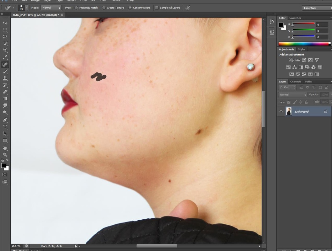
Step 3:
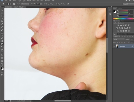
As I continued to use the smudge tool I began to use it to reduce the redness of my models cheeks by forming strokes and lines In the selected areas that I believed needed to be most focused on. Also when reducing the redness I paired the smudge tool with the spot healing brush which blurred the colour of the cheeks well as |
as the freckles my model had on her face. Both tools had positively helped contribute to a better appearing complexion in the edited photograph which was very impressive.
|
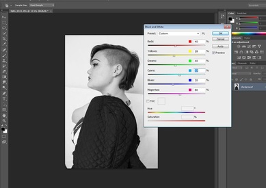
Step 4:
The final stage I had completed for this image was turning it from colour, into black and white. For this used the "black and white" option, found in adjustments on Photoshop. This tool enabled me to turn the image black and white and adjust the harsh contrasts of each colour component in the image by using moveable toggles. I used the black and white option twice for this edit as I wanted to achieve a specific and intense look which I had been inspired from by Rankin who popularly uses black and white for many of his photographs. After this step the image had been fully edited and was now ready to be printed. |
|
|
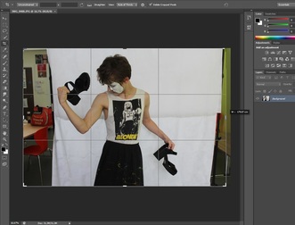
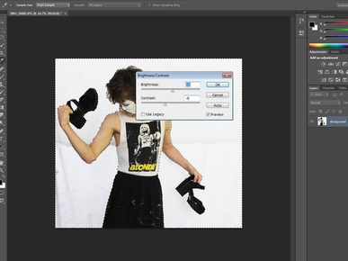
Step 1 - editing the photos for blonde :
Where this image had a messy and unattractive background, the most important thing I had to do was remove it. The first thing I did was use the crop tool to scale into the size of the image and have the right balance of the back drop on each side of the image as well. My reason for doing this was so that I could achieve a crisp and sharp looking image without anything distracting the focus of the viewer that would take away any attention from the focal point (my model) |
|
Step 2:
After using the previous methods from the first example, some of which include tools such as brightness and contrast, curves and the smudge tool. In this step I adjusted the brightness of the background and make up so it would have a crisp white finish, which would make the focal point my model as the colours would contrast each other more. In this edit I had used the smudge tool to enhance the overall size of my models biceps and triceps so he appeared more muscly and attractive. I did this because the "BLONDE" theme is to show how people shouldn't be judged based on what they wear and by using the smudge tool it let me develop the muscles further so my model would look older and more manly. 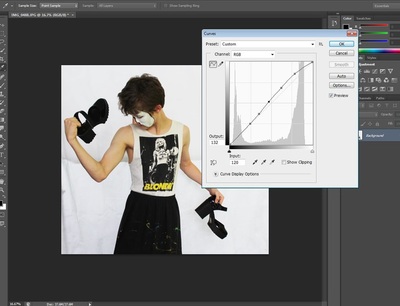
|
Step 3:
The final step I took for these images (in the blonde collection) where the overall balance of the photo. By using the curves tool I was able to adjust the colour and appearance of the image using this tool, to insure I was completely satisfied with the editing I had already done and what further adjustment could do to improve or balance out the original editing, without permanently changing the image or losing what I had previously done. |
|
in these edits I wanted to achieve a smaller looking figure and to do this I again used the smudge tool to adjust the size of the arms, chin and waist.
|
|
